I configured responsive layout for small and extra small screens to include positions footers 1,2,3 and 4 and position footer in Purity iii.
For iPhone only the position footer is shown, footers 1 thru 4 disappear. For iPad (small screens) it works fine, it reduces from footers 1-4 in a row to two rows of footers 1-2 and 3-4 as configured. Further reduction to phone size (extra small screen) to a column of footers 1,2,3 and 4 makes the footer 1-4 positions disappear. I tried to use the exact same configuration for small and extra small screens, but in all cases it seems that the footers 1 thru 4 positions are skipped for phone size screens.
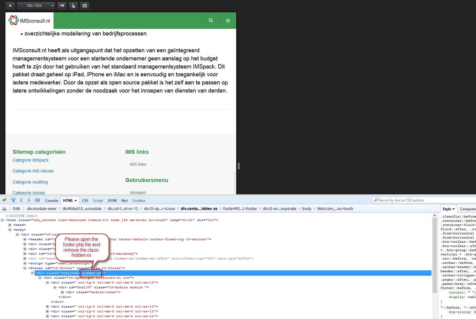
One of previous answers of this similar problem advised to remove hidden-xs_ in templates/purityiii/tpls/blocks/footer, but in my version this is not included, see content of ...../footer below. The code in my case seems quite different from the other users.
checkSpotlight('footer-sl', 'footer-1, footer-2, footer-3, footer-4, footer-5, footer-6')) : ?>
spotlight('footer-sl', 'footer-1, footer-2, footer-3, footer-4, footer-5, footer-6') ?>
Bootstrap is a front-end framework of Twitter, Inc. Code licensed under MIT License. Font Awesome font licensed under SIL OFL 1.1.
getParam('t3-rmvlogo', 1)): ?>
>Powered by T3 Framework
Please help!
T3 Community Discussion & Support
Let's build the best free Joomla template framework, together!
-
Rene

- Announcement
- Tuesday, 23 February 2016
- Subscribe via email
Comment
There are no comments made yet.

- Page :
- 1
There are no replies made for this post yet.
However, you are not allowed to reply to this post.
However, you are not allowed to reply to this post.